Limerick at Night needed to feel solid and trustworthy. It represents a long-term vision for the city at night, focused on safety, accessibility, culture, and placemaking.
Limerick at Night | Twilight Thursday
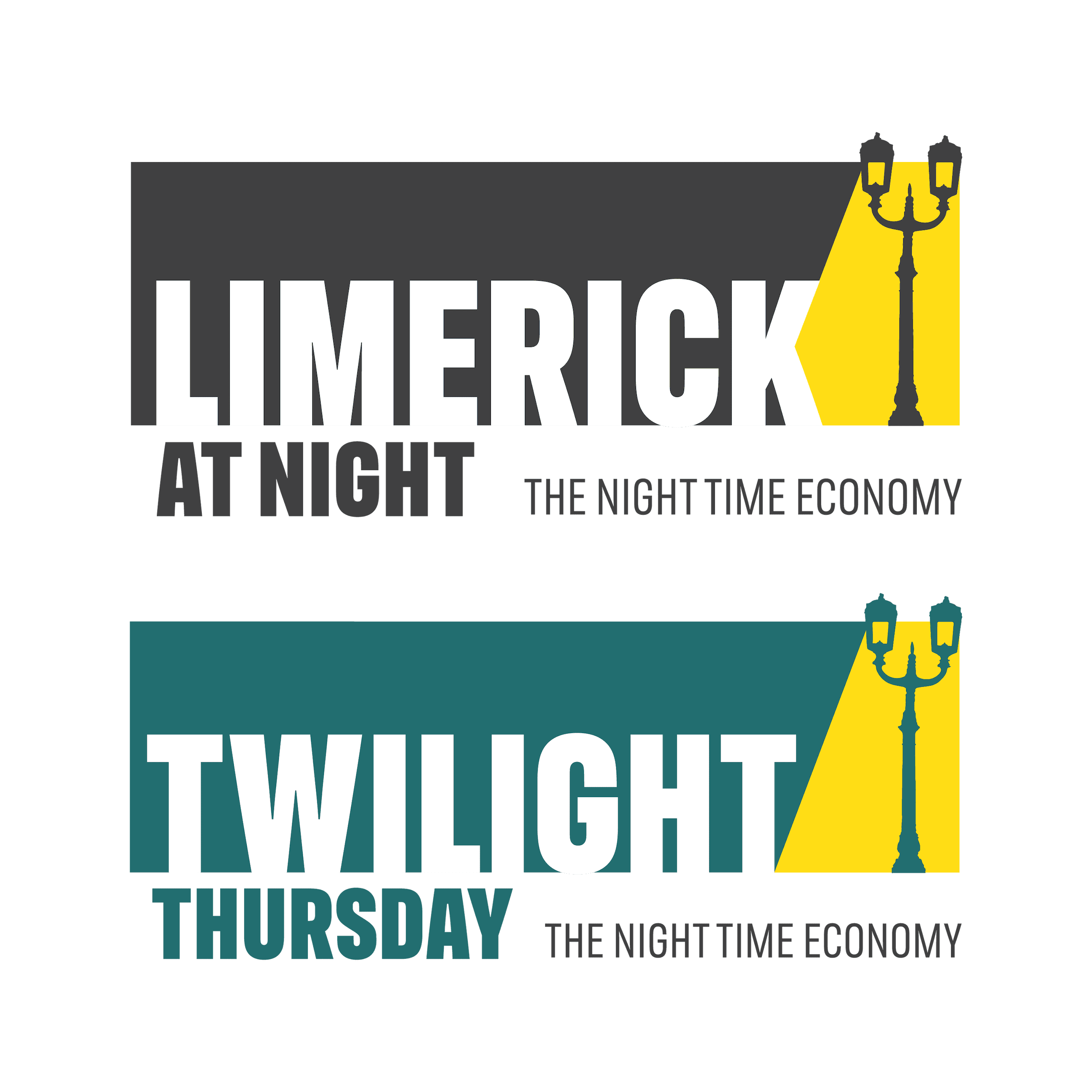
Two Identities, One Night-Time City
Limerick City and County Council set out to rethink how the city feels after dark. Limerick’s Night Time Economy initiative was born and, as part of that, the Limerick at Night brand was created to deliver the overall night-time programme, alongside an identity for Twilight Thursday, a monthly late-night event in the city centre.
The brief was simple in theory but ambitious in practice: create two visual identities that could work together, while each still having its own personality, suited to its role.
The Challenge
Twilight Thursday, on the other hand, is all about energy and immediacy, a regular invitation to head into town, stay out later, and experience the city differently.
The challenge was to design two identities that felt at home within Limerick’s existing brand, while still feeling fresh, expressive, and full of life. Different purposes, different tones, one shared foundation.
Our Approach
We started with the Limerick master brand, using it as a springboard rather than a rulebook. From there, we built two visual systems that naturally complement each other.
At the heart of both identities is light, inspired by the Georgian-era lamps on Sarsfield Bridge. These historic lamps, which mark a literal crossing point in the city, became a symbol of transition: the moment when day gives way to night.
For Limerick at Night, this idea is expressed in a confident and considered way, with light representing safety, warmth, visibility, and guidance as the city moves into evening.
Twilight Thursday takes the same foundation and turns up the energy. It’s playful, flexible, and designed to move, working seamlessly across posters, social media, and event listings. A brand built for repetition, variation, and a little surprise.
Together, the two identities form a connected system: distinct but clearly related, structured yet expressive. A shared visual language that captures Limerick’s night-time culture in a way that feels clear, welcoming, and full of energy.